

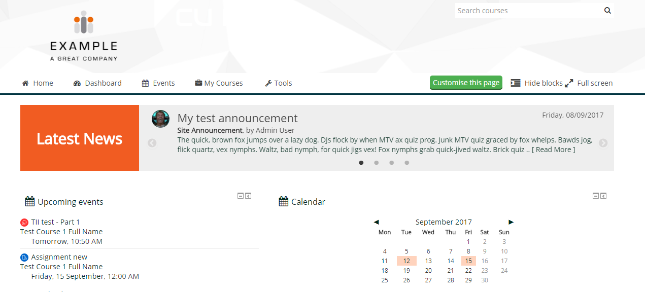


Moodle News Slider is a jquery news slider that integrates the slick carousel jquery slider with some customisation. It has been designed to work well on large and small screen devices. It displays site announcements, course announcements for the current user, or both of these. These are ordered by date.
Currently this plugin works only with the Adaptable theme, version 1.4 onwards.
The video below shows the News Slider plugin in use alongside two other plugins (Course Discuss and Discussion Feed):
Configuration
Each slider instance can be configured to display only site announcements, course announcements or both. There are also options for max length of subject and excerpt strings. Full configuration options available are shown below. When used on a course page, only that specific course's unread announcements will display.
General configuration
- Configurable max length of excerpt
- Configurable max length of subject
- Use caching plus cache expiry time
Per instance configuration
Compatibility
- Moodle 3.7, 3.8 (Older version that supports from 3.2 to 3.6 also available, but it won't have latest updates)
- Adaptable version 1.4 onwards
Guidelines for use
You may want to experiment with the general configuration settings. E.g. for wider displays, you could increase max lengths of excerpts and vice-versa.
Please note that caching is switched on by default and set to expire every 5 minutes (300) for a user session by default.
Using the slider on course pages
There is custom block region on course pages in the Adaptable theme called "course page slider region", designed for use with the news slider.
See basic instructions below:
1. Add the news slider to the "Course slider" block region that can be seen by admins on the frontpage. Configure it to appear on all pages.
2. Go to any course page. You should the news slider appear just above course content. Now configure this block to appear only on course pages.
Customising colour and styling using CSS
You can customise various parts of the slider using CSS, such as the banner colour, font size, type etc. You can use the developer tools of Chrome and Firefox for example, to find out the name of the css selectors that need to be modified. Below are some examples to get you started.
Slider left banner colour
A common requirement is to change the default colour of the left banner from orange, to one that matches the colours of the site. This can be done using css, as per the below example. In this case it changes it to a blue.
.slider-banner-col {
background-color: #0066CC;
}
Example CSS to change various styling elements of the slider
.slider-banner-col {
background-color: #FF0000; /* Change banner background colour */
}
/* This is the text displayed inside the left banner */
.slider-banner-col span {
color: #ffe968; /* Change text colour */
font-size: 26px; /* Change font size */
}
/* !important is required in this case to override it correctly */
.news-slider .slick-dots li button:before {
font-size: 18px !important;
color: red !important;
opacity: 1; /* To make it a solid colour */
}Known issues
When the slider is used with Adaptable tabs, or anything similar, it is possible that when changing tabs and going back and forth, the slider will render slides all the way down the page momentarily in a messy fashion. This appears to be due to how the slick js works internally. A way around it is to inser code like the following within the custom JS section of Adaptable settings (sample shown for Adaptable tabs):
<script type="text/javascript">
if (typeof $('.responsive').slick === "function") {
$("#coursetabcontainer :radio").on("change", function() {
$('.responsive').slick('setPosition');
});
$("#dashboardtabcontainer :radio").on("change", function() {
$('.responsive').slick('setPosition');
});
}
</script>