OU multiple response

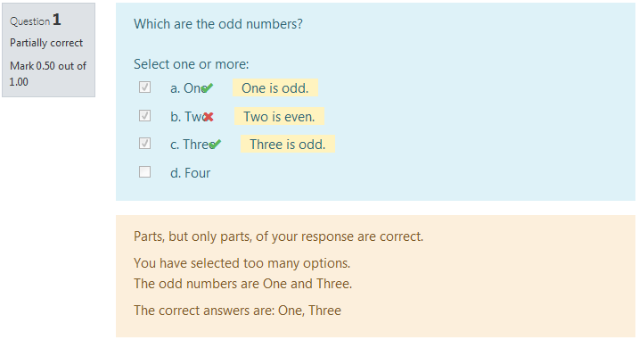
The main difference from the standard Moodle multiple choice question type is in the way that grading works. When creating the question, the teacher just indicates which choices are correct. If there are n correct choices, then the student scores 1/n for each correct choice. If they select too many choices, then incorrect choices outweigh correct ones.
Price option: Free

Supports Moodle 2.1-5.0 See all versions
Latest release: 12 months ago
Installations: 1597
Downloads (last 90 days): 301

Frankenstyle name: qtype_oumultiresponse
Question types
Open University

Comments

Comments are no longer open for new posts. Existing comments remain available to read.

Hi there,
We are testing this very valuable plugin but are facing difficulties in grading. It is said that the student scores 1/n for each correct choice, and loses 1/n for each incorrect choice and here is what we get for a question with 5 options (3 correct and 2 incorrect)
1 correct 0 incorrect -> 33%
2 correct 0 incorrect -> 66%
3 correct 0 incorrect -> 100%
1 correct 1 incorrect -> 33%
2 correct 1 incorrect -> 66%
3 correct 1 incorrect -> 66%
1 correct 2 incorrect -> 33%
2 correct 2 incorrect -> 33%
3 correct 2 incorrect -> 33%
0 correct 1 incorrect -> 0%
0 correct 2 incorrect -> 0%
Any help?
Thanks in advance
Yes. that is the right general approach. However, the styles in Moodle core for this keep changing. We did a fix like this in our theme for Modoel 3.9.2, and then it broke again for 3.9.3.
I had to fix the alignment issue for our Moodle 3.9. Since the renderer looked to be based off of multichoice questions, I found that updating the following two classes in styles.css to match multichoice worked.
.que.oumultiresponse .answer div.r1 {
/* padding: 0.3em 0 0.3em 25px;
text-indent: -25px; */
display: flex;
margin: 0.25rem 0;
align-items: flex-start;
}
.que.oumultiresponse .answer div.r1 input {
/* margin: 0 5px;
padding: 0;
width: 15px; */
margin: 0.3rem 0.5rem;
width: 14px;
}
I am afraid the answer is "When I get time". That might be this weeek, but it might not.
Hi, are there any news on the update of the plugin. I would like to use the combined question plugin but the tickboxes and the answer options continue to not be aligned. The answers go to the next line.
Hi Tim, thanks for your prompt reply. I will watch for updates.
There were changes to core multiple-choice question type in Moodle 3.9, with ongoing bug fixes in 3.9.1 and 3.9.2 to sort out some issues.
I guess that in time we will need to make simiilar changes to this plugin, to match what is done in the core question types, but I will wait for the core code to finalise before i do anything.
Hello we are upgrading a site from 3.5 to 3.9 and the display of your question type is not correct anymore. We tested in different 3.9 sites without any theming but the result is the same. The tickboxes and answer options are not outlined. The text for the answer is one line lower than the tickbox. Please advise! I could not sent a screenshot here but please let me know when you need any. Thanks Peter Jonker
I think I take the opposite view. This question type has a simple scoring system: +1/n for each right choice selected, -1/n for each wrong choice. If you want the score for selecting everything to be 0, then make sure you have at least as many distractors as right choices.
(I am now imaging a question with choices like "This is a wrong option. Don't select it. Are you event paying attention?" smile Is that as pedagogically invalid as it at first seems?)
Thanks Philip! I think, this is a bug and should be fixed.
Hi, quick question. When there are more right answers than wrong answers and a student selects everything, he still gets more than 0 points. Could there be an option to automatically give 0 points when a student selects everything?
This plugin inherits that behaviour from the standard Moodle question type. So, this is really MDL-43174.
At the moment, the default method for showing the correct answers to the learner after they have completed the question, is to list all the correct answers as a single list each item separated with a comma. This is fine if the answers are short (e.g. 1 or 2 words), but if the answers are longer (and in particular if they contain commas) then the end result is very confusing. Would it be possible to improve this excellent plugin by displaying the correct answers as a simple bulleted list instead or give us the choice of display options when we create the question? Thanks
The same to us smile
Could we have a version for 3.3 and / or 3.4 please? We are thinking upgrading but many of our plug-ins only work up to 3.1! Thanks!